I am planning a journey to Wien: the main goal is to visit this amazing exhibition at Winter Palace. I will be there for less than 36 hours and I have to do my best to see everything I am interested in. Usually things I am interested in (contemporary architecture and beautiful streets) cannot be found in guides, so I decided to make my own guide. In these last years I saved on my Pinterest many nice pictures (I have tried to label them correctly, but I failed miserably). I took some of the best things and put them on a map on Google Maps. (this one)
Basta avere un account su Google per poter creare una propria mappa e poterla condividere. Avevo fatto già un paio di mappe, ad esempio per esami al master "Il progetto della smart city". Una era un esperimento che mi interessava particolarmente: una mappa condivisa con gli altri studenti in modo da poter condividere le foto e le impressioni raccolte durante un sopralluogo in vista dell'esame collettivo di fine corso. Mi aspettavo che gli altri studenti avrebbero inserito il proprio materiale in modo da poterci confrontare sulle rispettive idee. In realtà nessuno ha utilizzato la mappa, non so se per poco interesse o se per carenze nella mappa. (qui il link alla mappa)
You only need a Google account to create your map and to share it. I have already made some maps, for instance for exams at master "Designing the smart city". One of these map was an experiment I was particularly interested in: a map shared with other students so we could share photos and impressions caught during a survey needed for the last collective exam. I hoped other students would put their data so we could discuss ideas. But no one used the map, I do not know if it was lack of interest or if the map was poorly designed. (map link here)
Le mappe sono private di default, per condividere è necessario cliccare sull'icona nel menù di controllo (evidenziazione mia)
Maps are personal by default, to share them you have to click on the icon on the control menu (my highlight)

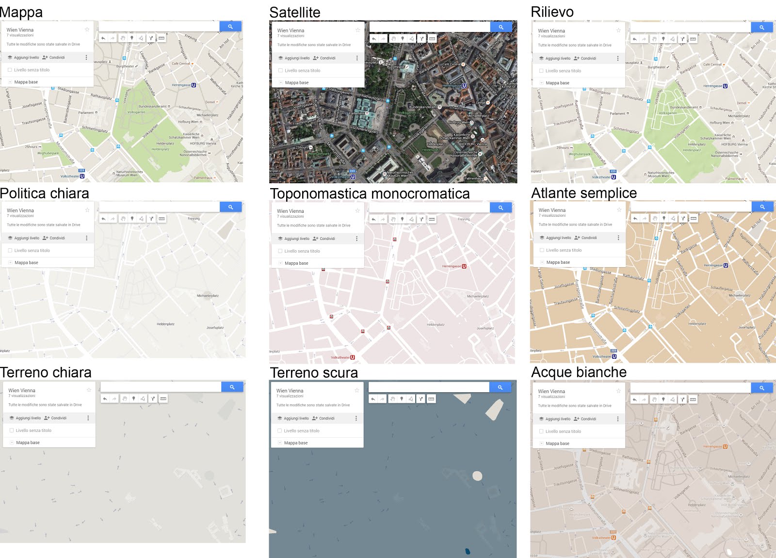
In fondo al menù è possibile scegliere tra diverse mappe di sfondo.
It is possible to organize data using layers; it is possible to show or hide groups of data by working on layers.
At the bottom of the menu it is possible to choose a map as background.
It is a bit funny to see some buildings popping out in some of these maps: maybe it is a bug due to 3D buildings, they do not appear in the 'terrain' map, but they appear in some of the other maps.
It is possible to add points, lines and shapes, using tools in the upper part of the screen.

Lo strumento 'Aggiungi indicazioni' permette di creare un percorso tra diversi punti della città: è possibile selezionare il mezzo di trasporto, scegliendo tra auto, bici o piedi, inserire più destinazioni e modificare il percorso, trascinando col cursore la linea azzurra che rappresenta il tragitto. Da notare che il percorso in bici rispetta correttamente i sensi unici ed è quindi diverso rispetto a quello a piedi. Cliccando sui tre pallini accanto al nome del livello è possibile aprire una finestra che fornisce la descrizione dettagliata del percorso, utile per chi è poco abituato alle mappe.
'Get directions' allows you to build a path between places in town: it is possible to choose the mean of transportation, between car, bike and foot, you con add different destinations and change the path, dragging the blue line of the path with the cursor. Notice that the bike path follows the one way signals so bike and pedestrian journeys are different. Clicking on the three dots beside the layer's name you can open a window that give you detailed description of the journey, very usefull if you are not used to maps.


Asking for bike directions some roads turn green: I suppose the different shades match different types of cycling infrastructures, but there is no explanation of symbols. To get it you have to open Google Map, let's say, in its plain version. Clicking on the three lines beside the search tool you can access the option menu, among others you will find the cycling map. At the bottom of the page, not hidden enough, will appear labels' explanation.

And how to add all cycling routes to my personal map? It is less easy than expected. You have to open Map in a new tab, click on menu, by clicking the three lines, and click on "My maps" to get the list of personal maps. Click again on the three lines and you will see again the option menu, look for the cycling map or the public transport. Now you will see the informations requested on the map. By clicking on the desired personal map, it will appear on the map, together with the information gotten by the option menu. It is a bit twisted, it would be much easier to allow users to add these data from the control panel: datas could be a type of layer (i.e.: 'cycling', 'transport' and 'traffic') you can add to your map, else it could be a background map visualizing datas ('bike map' , 'public transport map' and 'trafic map').
Un altro punto un po'oscuro è la stampa della mappa. Non è complicato: basta cliccare sui soliti tre punti e appare un menù a tendina che permette di stampare la mappa, creando un file pdf o un jpg. Il problema è che la stampa ha una scala completamente diversa rispetto a quanto visualizzato a schermo. Sotto potete vedere fianco a fianco la mappa a schermo, sulla sinistra, e il file di stampa, a destra. Inoltre, mentre nella visualizzazione standard Maps mostra in basso a sinistra un segnalino di scala, nella visualizzazione 'Le mie mappe' il segnalino di scala scompare; questa mancanza è compensata dallo strumento 'righello' che permette di misurare sullo schermo le distanze, ma è ovviamente inutile una volta stampata la mappa.
Another issue is to print the map. It is not complicated: just click on the usual three dots and a menu will appear, allowing you to print your map, by creating a pdf or jpg file. The problem is the printed map has a completely different scale than the map on screen. You can see here side by side the map on the screen, on the left, and the map ready to be printed, on the right. Moreover, while in standard Google Maps you get a scale, in the bottom left corner, in 'My maps' you get no scale indication: the 'ruler' instrument partially make up for this, but of course it works on screen and it is useless in a printed map.

L'impressione è che i due servizi, Maps e 'Le mie mappe' siano impostati in modo leggermente diverso, forse perchè sviluppati da gruppi diversi. Per l'utente però il risultato è decisamente scomodo: le funzioni sono diverse nei due servizi e si fatica a mettere insieme informazioni che pure sono a disposizione di Google.
You get the impression that the two services, Maps and 'My maps' have been developed in different ways, maybe by two different teams. As result, the user feels uneasy: different options in the two panels and it is too complicated to bring together data that belong to Google, nonetheless.